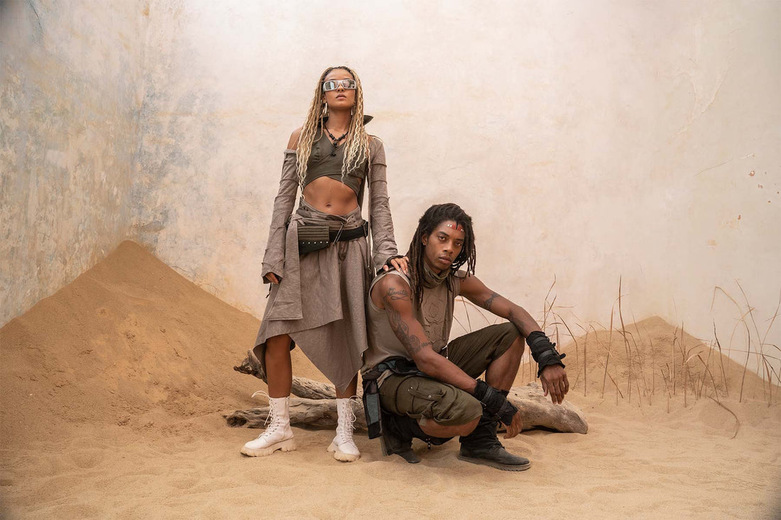
Desertcore is the sand-and-rust aesthetic that circulates on Pinterest and TikTok as a mood rather than a costume, and we have cut linen and cotton gauze in exactly these tones since 1999, so this one lands close to what we already make.
Where does the colour come from in desertcore?
The colour comes off the sand. That is the whole trick. Desertcore's base is tan, beige and soft brown, with terracotta and rust brought in as accents, and ochre, bone and adobe pink filling out the edges. Nothing in it is saturated. The palette leans muted and monochrome, and the effect people are after is faded, as if the sun had been at the fabric for a season before you put it on.
We work in this register all the time, mostly in our Raw Organic flavour, where the natural undyed tone of the cloth is the point and colour arrives quietly rather than shouting. A bone linen and a rust cotton sitting next to each other is not a bold pairing, it is a tonal one, and the two hold together because neither is trying to win. That restraint is what separates a desert palette from a beach one. The beach reaches for brights. The desert dims everything down to the ground it stands on.
Why is drape the mood in desertcore, not the physics?
Drape here is atmosphere, not engineering. The romantic version of the desert look, the one filling the mood boards, is about how loose cloth moves and reads on the body, not about surviving heat or crossing dunes. That is the split worth naming early, because there is a second desert-inspired trend running alongside it. Pinterest's own 2026 forecasting named a look it calls Khaki Coded, and that one is expedition wear, field jackets, khaki bermudas, pockets on pockets, adventure-ready. Useful, functional, and a completely different animal.
Desertcore does the opposite of the dune wardrobe. It is drape-forward, relaxed and flowing, and it wants to look like it is doing nothing on purpose. When we cut a loose kaftan or a wide trouser in cotton gauze, the fall of the cloth is doing all the work. There is no hardware, no strapping, no utility read. The garment hangs off the shoulder and moves when you move, and that ease is the entire aesthetic. Structure would kill it.
What desertcore is not: boho, Western and the Southwestern cousin
Desertcore gets lumped in with three neighbours it is not. Here is how they actually differ.
It is not boho. Boho is maximalist and eclectic, built on global-travel references, Moroccan textiles, clashing patterns, fringe, crochet, lace, saturated colour. Desertcore is the narrow, tonal version. It keeps to one landscape, drops the pattern-clash, and holds a muted sand-to-rust range. Boho piles things on. Desertcore takes things away.
It is not Western. Western runs on American-frontier iconography, cowboy hats, boots, rancher styling, Old West nostalgia. Desertcore carries none of that costume. There is no character to play.
And it is not the Southwestern cousin. Southwestern draws on Native American, Spanish and Mexican design traditions, and it is far more vibrant, turquoise, adobe pink, cactus green, sunset purple, plus embroidery and turquoise-and-jasper jewellery. That is a pattern-and-colour-forward look tied to specific cultural motifs. Desertcore is iconography-light by comparison. It reads the desert environment itself, the sun-bleached and textural side of it, rather than dressing in anyone's heritage costume. When you strip out the frontier symbolism and the ethnic motifs, what is left is the mood, and the mood is what desertcore keeps.
What cloth already fits the earth register?
Linen, cotton gauze and hemp. These are the three natural fibres the whole aesthetic rests on, and they are three we already cut with.
Linen is treated as the defining cloth, and for good reason. It wicks moisture, dries fast, and softens the more you wear it, so it earns its place in heat rather than just referencing it. Cotton gauze comes up again and again alongside it, lighter and smoother than flax linen, breathable, and it drapes beautifully, which is exactly why it suits a drape-first look. Hemp sits in the same family, another breathable natural fibre that holds a strong, quiet line.
We have been an alternative maker since 1999, designing and making in Bali and trading from our Camden flagship since 2007, and the earth register has always been part of our Raw Organic side. A stone-washed hemp trouser, an undyed cotton gauze top, a linen layer in a rust or bone tone, these are things we cut because we like how they wear, not because a mood board arrived. The construction values the aesthetic points at, natural fibres, simple durable making, garments built to last rather than churn, are the ones we build to anyway. So the cloth desertcore wants is the cloth already on our tables.
How do you wear the feeling without dressing as a desert?
Wear the tones and the drape, skip the theme. The mistake is treating desertcore as a fancy-dress brief, loading up on the wide-brim hat, the satchel, the headwrap and the turquoise until you look like a photo shoot in a canyon. That over-tips it into the Southwestern cousin or straight into costume, and costume is the one thing this look is not.
Keep it to two moves. First, the palette. Build the outfit inside the muted range, bone, sand, ochre, rust, and let the tones sit near each other without a hard contrast breaking them up. A rust top over a bone trouser holds the whole feeling on colour alone. Second, the drape. Choose the loose, flowing cut over the structured one, and let one relaxed garment carry the silhouette rather than layering three. A single draped kaftan in cotton gauze does more than a full head-to-toe kit.
Layers earn their place only where the climate does the swinging, a light sweater or an open layer for the temperature drop after dark, which is honest to the desert rather than decorative. Everything else, leave off. The look is meant to read as effortless, and the fastest way to lose that is to try.
Why is a sun-bleached tone harder to make than a bold one?
Because faded is a made effect, not an absence of one. A bold colour is the easy one to hit. You saturate the dye, the tone lands loud, and the eye reads it as deliberate. A sun-bleached tone has to look like the sun did it, which means it has to look like nothing was decided at all, and that is far harder to land.
Get a muted tone slightly wrong and it does not read as desert. It reads as dull, or worse, as a colour that faded by accident in the wash. The dusty, faded, ground-coloured range desertcore lives in is a narrow one, and the difference between an ochre that looks sun-baked and an ochre that looks tired is small and unforgiving. You are chasing a tone that has to feel weathered and intentional at once, warm rather than washed-out, quiet rather than flat.
That is the real craft under this whole aesthetic. Not the hat, not the drape, but the tone. Anyone can put a loose trouser in a bright colour on a body. Getting the cloth to sit in that exact bone or rust or ochre, so it looks like the desert made it rather than a factory, is the part that takes the years. The look does nothing on purpose, and doing nothing convincingly is the hardest thing to cut.